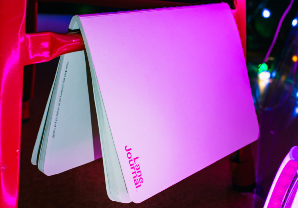
Lane Journal – Publication. A reflective tool designed to help creatives slow down, reconnect with themselves, and make sense of their inner world through writing and visual prompts.
Design Process. Lane Journal began as a response to the overwhelming pace of modern life and my own experiences in therapy and self-reflection. I combined design, psychology, and storytelling to create a tactile, research-backed journaling experience. The process involved developing a visual identity that felt calm yet expressive, designing custom spreads and prompts informed by clinical psychology literature, and testing layout prototypes for flow and accessibility. Each design choice, from paper texture to typography was made to evoke stillness and presence, encouraging users to explore who they are behind the noise.

Lane Studio – Website & Photography. Cohesive digital and visual identity for Lane Studio, designed to reflect its calm, reflective tone and creative ethos. The website and photography work together to showcase design-led self-reflection products through natural light, minimalist composition, and an editorial sensibility.
Design Process, It began by defining the emotional and visual language of Lane Studio. A grounded, poetic, and honest. I developed a clean, intuitive website layout that balances negative space with tactile imagery, allowing the products and storytelling to breathe. The photography direction focused on authenticity and texture, capturing moments of stillness and warmth that echo the brand’s values. Every element, from typography to lighting, was intentionally chosen to create a sense of clarity and connection, an online space that feels as thoughtful and considered as the work itself.
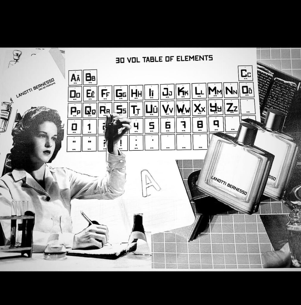
30 VOL Typeface. A bold, experimental display typeface inspired by laboratory precision and chemical notation. Designed to merge the structure of scientific classification with the human touch of analogue mark-making, 30 VOL brings a sense of order and curiosity to any design context.
Design Process. The creation of 30 VOL began with the idea of bridging science and design, a typographic experiment rooted in the visual language of chemistry labs and mid-century scientific documentation. I explored geometric proportions, modular grids, and letterforms that feel both mechanical and handmade. Each character was refined through digital sketching and iterative testing, aiming to balance clarity with character. The final outcome reflects a playful yet methodical approach to typography, one that celebrates experimentation as a core part of design thinking.

TOMA Coffee Roasters. Packaging design for a Dunedin-based, family-run coffee brand named after Tomahawk Beach, capturing the relaxed, coastal vibe through soft blues and beach-inspired tones.
Design Process. The TOMA project drew inspiration from the brand’s roots — a local roastery grounded in family, community, and the laid-back rhythm of the coast. Exploring visual connections between sea, sand, and surf, developing a palette of muted blues and warm neutrals to reflect the beachside atmosphere. The typography and layout were kept clean and modern, allowing the colour and subtle textures to evoke a sense of calm and authenticity. Through iteration, I refined how each element communicated the story of place and belonging, creating packaging that feels both contemporary and deeply local.
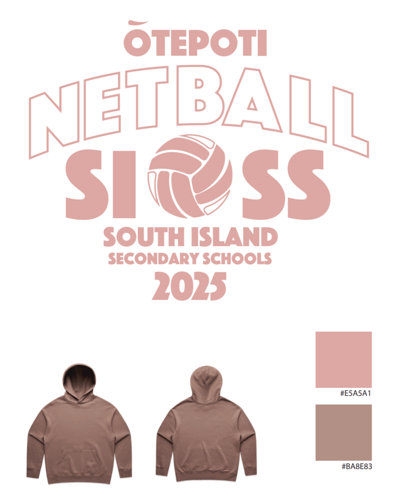
Ōtepoti SISS Netball 2025 – Event Branding. Bold and energetic identity for the 2025 South Island Secondary Schools Netball Tournament, hosted in Ōtepoti Dunedin. The design captures the excitement and unity of school sport through dynamic typography and a clean, modern netball motif, developed for use across merchandise, uniforms, and event promotions.
Design Process. The goal for this project was to create a fun, contemporary identity that celebrated youth, sport, and regional pride. I began by researching previous SISS events and identifying ways to modernise the look while keeping it accessible for diverse applications. The curved, arched typography reflects the energy and motion of the game, while the central netball graphic anchors the design with clarity and focus. A warm, monochrome colour palette was chosen for versatility across digital and printed materials, ensuring the brand feels cohesive from apparel to banners. The final result delivers a strong, spirited visual identity that connects players, schools, and community under one banner.
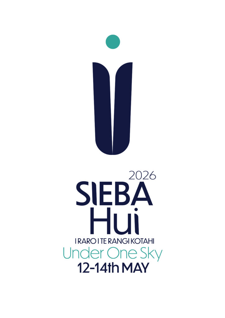
SIEBA HUI – Branding. A visual identity and set of event materials created for a collaborative education hui, celebrating connection, culture, and knowledge-sharing across Aotearoa.
Design Process. For the Sieba Hui project, I focused on translating the event’s values of unity and learning into a cohesive visual language. The design process involved researching Māori motifs and regional colour palettes to ensure cultural respect and relevance. I developed logo marks, print collateral, and digital assets that balanced professionalism with warmth, using layered textures and organic shapes to represent people coming together. Collaboration with stakeholders was key — refining typography, layout, and iconography to create a design system that felt inclusive, grounded, and distinctly local.

Eternal: Jungle – Event Branding & Social Media Assets
High-energy visual identity for Eternal: Jungle featuring Ruby Ruinz and guests. The poster and digital assets capture the raw underground music through manual textures, dynamic typography, and vibrant contrast designed to stand out both online and in print.
Process Paragraph:
The creative direction began with exploring visual culture of the drum & bass scene. I experimented with motion-inspired graphics, distressed overlays, and contrasting colour palettes to evoke the pulse of live performance. The typography was crafted to feel gritty yet cohesive across poster, story, and feed formats. The final suite of assets formed a consistent identity that translated seamlessly between digital promotion and physical presence, amplifying the event’s atmosphere and audience connection.
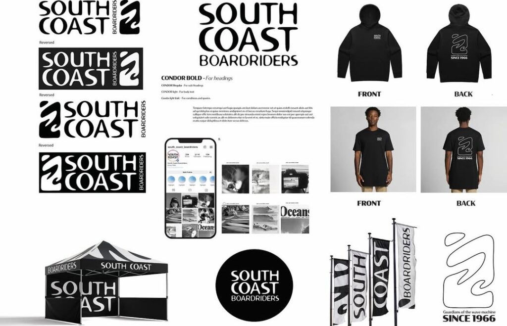
South Coast Boardriders – Brand Identity. A refreshed visual identity for Dunedin’s South Coast Boardriders, celebrating the local surf culture and its long-standing community roots. The design combines organic wave-inspired forms with bold, confident typography to reflect both the power of the ocean and the laid-back authenticity of the South Coast.
Design Process. This branding project began with research into Dunedin’s surf culture and the history of South Coast Boardriders, a club founded in 1966. I wanted to create a system that felt both timeless and contemporary — one that locals could instantly recognise and wear with pride. Through iterative sketches and digital refinements, the wave mark was developed as a fluid, symbolic form representing motion, energy, and connection to the sea. The use of the Condor type family reinforces a friendly yet structured identity that translates across apparel, signage, and digital media. The final outcome captures the essence of community, coastline, and continuity.
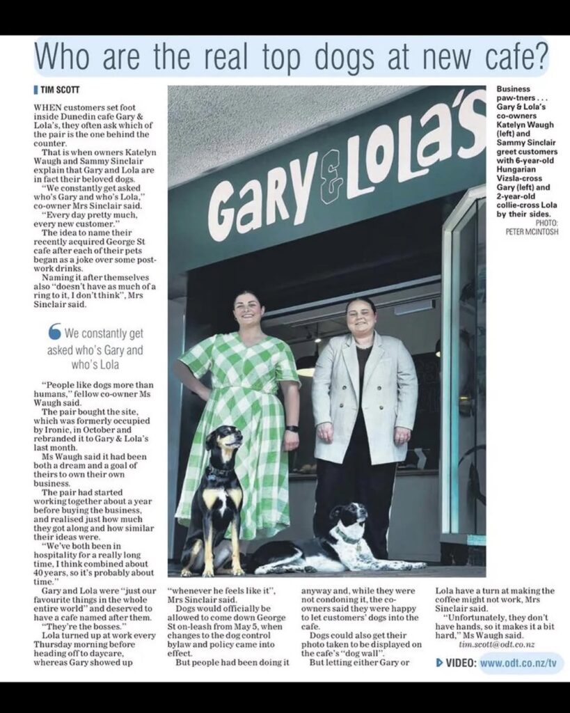
Gary & Lola’s – Café Branding. A warm, playful identity for Gary & Lola’s, a Dunedin café named after the owners’ beloved dogs. The brand captures the café’s friendly, community-driven spirit through approachable typography and a nostalgic aesthetic that feels both contemporary and comforting.
Design Process. The design process began with understanding Gary & Lola’s story — a heartfelt nod to companionship, creativity, and the joy of simple pleasures. I explored visual directions that blended mid-century charm with a modern café sensibility, landing on a hand-rendered logotype that reflects the personal, local touch behind the brand. Inspired by the café’s connection to its canine namesakes, the identity balances sophistication with a light-hearted edge. The result is a cohesive visual system that feels familiar, friendly, and unmistakably Dunedin — a space where everyone, human or hound, feels at home.
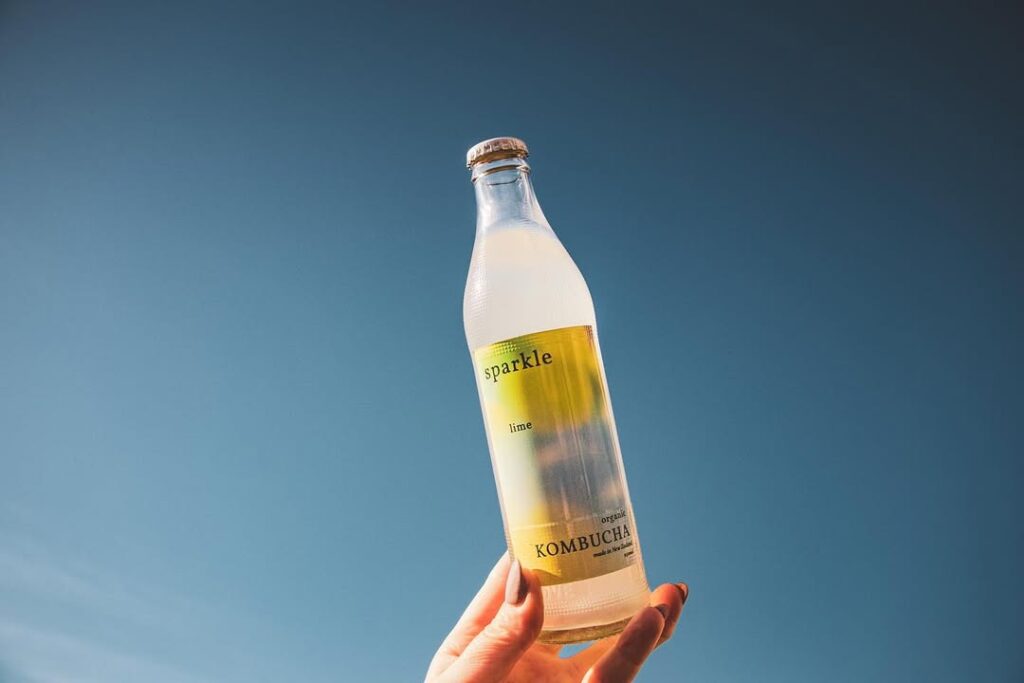
Sparkle – Packaging Prototype. A packaging design series that captures the light, uplifting nature of kombucha through soft gradient tones unique to each flavour.
Design Process. The Sparkle Kombucha project explored how colour and form can express flavour and feeling. I began by mapping emotional and sensory associations for each flavour, then developed a gradient system that visually translated taste into tone — from crisp citrus hues to soothing berry blends. The design focused on minimalism and harmony, pairing clean typography with soft transitions of colour to evoke freshness and calm. Through iterative testing, I refined how each gradient interacted with the label shape, ensuring consistency across the range while allowing each bottle its own identity.
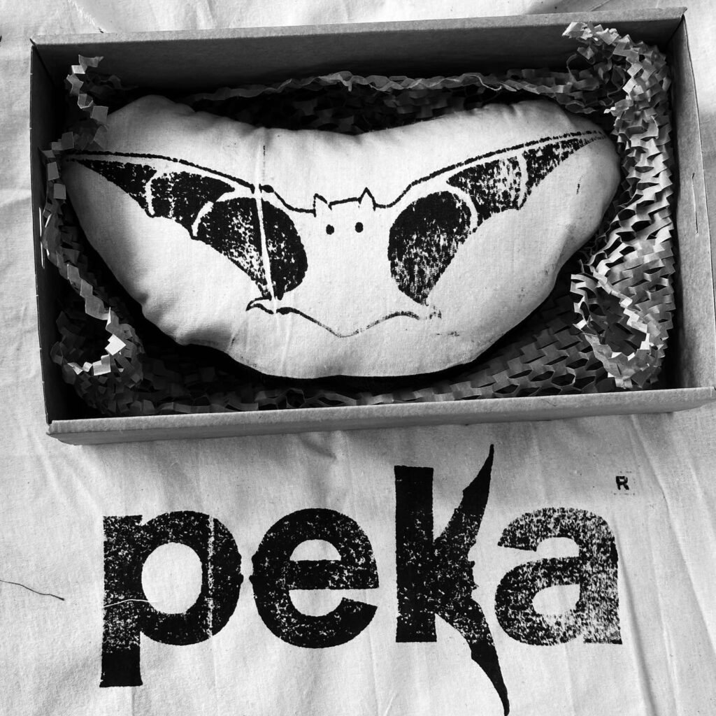
Peka Fundraiser – Branding. A visual identity created for a local fundraiser supporting the endangered pekapeka (native New Zealand bat), celebrating conservation through simple, symbolic design.
Design Process. The Peka logo was inspired by the unique form and nocturnal nature of the pekapeka. I began by sketching simplified bat silhouettes, exploring ways to convey motion and protection without losing clarity at small scales. The final design uses clean geometric lines and soft curves to suggest both flight and care — reflecting the community’s effort to safeguard this rare species. Natural tones and subtle contrasts were chosen to honour the creature’s environment and create a logo that feels both modern and rooted in Aotearoa’s ecology.
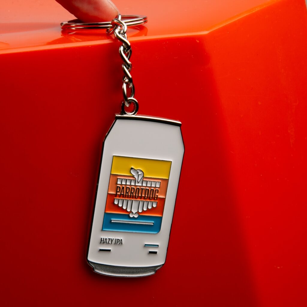
Product Photography – The Print Room. A product photography series capturing the handcrafted detail and playful personality of Print Room’s custom key rings.
Design Process. For this shoot, I focused on showcasing the texture, colour, and individuality of each key ring while keeping the overall composition clean and brand-aligned. Using natural light and soft shadows, I created a warm, authentic tone that reflected Print Room’s creative studio environment. The process involved experimenting with different surfaces and angles to highlight the embossed details and metallic finishes. Each image was edited for consistency across the set, ensuring the final collection felt cohesive, tactile, and true to the brand’s design-led aesthetic.
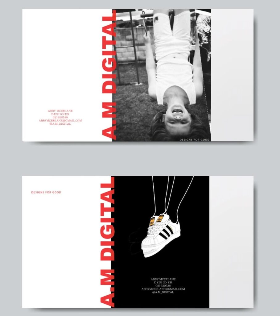
Business Card – Graphic Design. A playful, personal design featuring a photo of my younger self on one side and my current self on the other, symbolising growth, creativity, and the journey behind my practice.
Process Process. This concept was born from the idea of reconnecting with my creative roots and showing the human story behind A.M Digital. I wanted my business card to feel approachable and memorable — something that sparks conversation. I experimented with layout, contrast, and image cropping before settling on a mirrored composition that visually links past and present. The typography and colour palette were kept minimal to let the imagery speak, while the tactile print finish added warmth and personality. The result is a business card that reflects both playfulness and authenticity — a small piece of my brand story in hand.
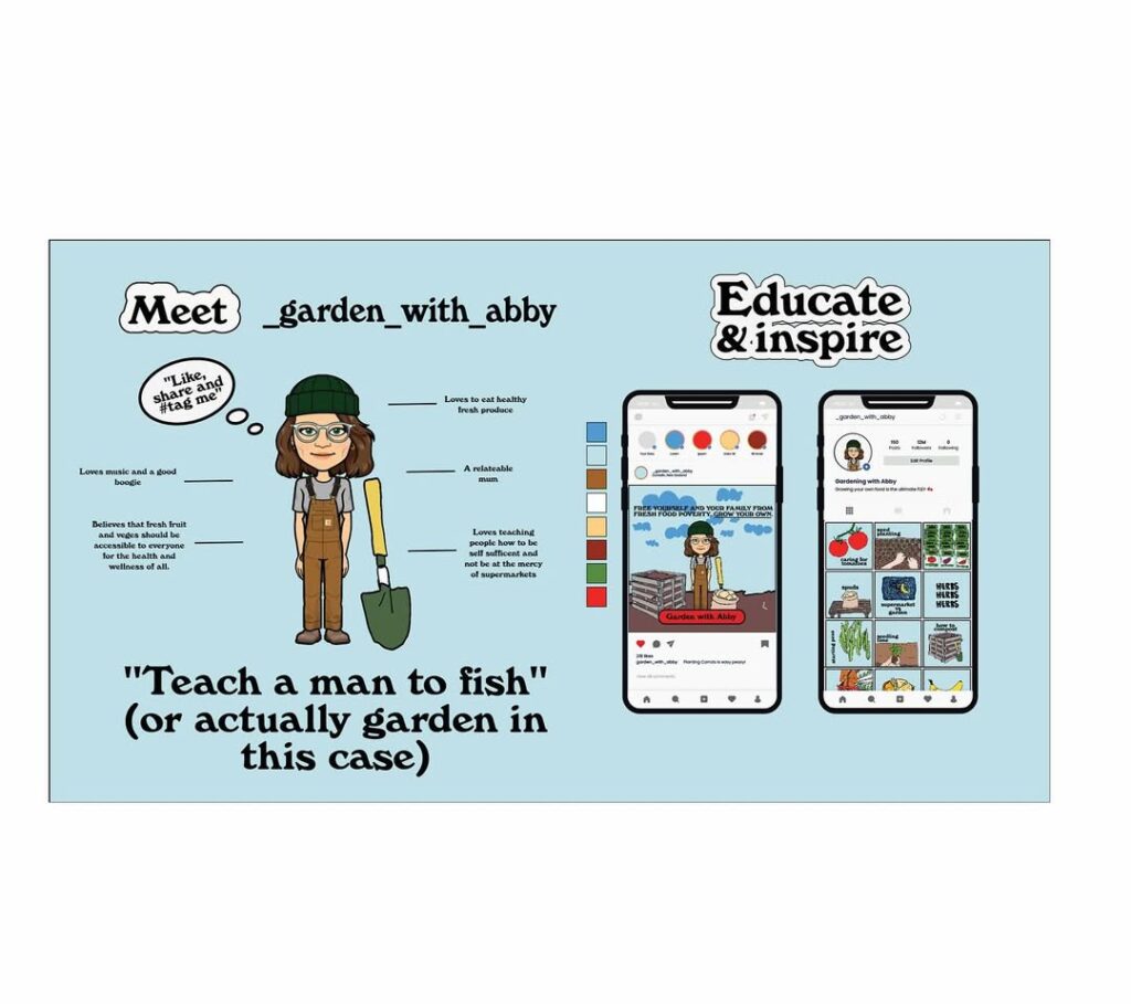
Social good Campaign. Food Poverty NZ , a social good campaign and design communication prototype encouraging New Zealanders to grow their own food in response to rising living costs and food insecurity.
Design Process. The project aimed to inspire small-scale action through accessible design and community engagement. I began by researching the social and economic impacts of food insecurity in Aotearoa, alongside behavioural design strategies that motivate positive change. The prototype combined visual storytelling, educational resources, and localised messaging to empower people to start home or community gardens. I developed a campaign identity, posters, and digital mockups using earthy tones and approachable typography to reflect growth and resilience. The process focused on empathy-driven communication — using design as a tool to reconnect people with the land, their wellbeing, and each other.
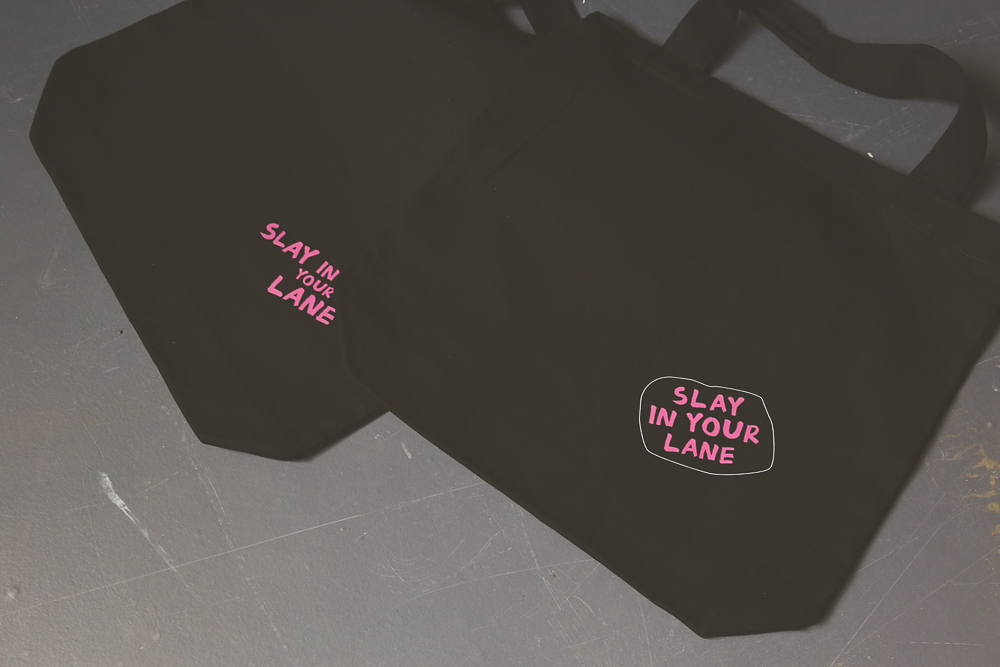
Lane Journal: Slay in Your Lane Merch. Playful branding and merch collection designed to remind people to stay true to themselves while celebrating individuality and fun.
Process paragraph. For the Slay in Your Lane project, I wanted the branding to feel bold, uplifting, and relatable. I explored typography, colour palettes, and illustrative elements that balanced confidence with whimsy, reflecting the journal’s ethos of self-discovery with a playful edge. The merch — including stickers, apparel, and accessories — was designed to carry the message beyond the pages, creating tangible touchpoints for the community. The process involved sketching concepts, iterating on visual language, and testing mockups to ensure the tone was energetic yet approachable. Every element was crafted to inspire joy, self-expression, and a reminder to embrace one’s unique path.